Beyond Bootstrap
Moving from UI toolkit to component library
The first factory predates the industrial revolution by hundreds of years. Venice’s Arsenal pioneered assembling naval ships out of standardized parts. Engineers of the time discovered that it was quicker and easier to assemble complex things from their constituent parts rather than build them from scratch. Today, we’re seeing this idea of prefabrication and assembly take hold in a different sphere of engineering: building user interfaces.
User interfaces are increasingly assembled from standardized parts. UI toolkits like Bootstrap were among the first to provide a generic collection of parts for web UIs. These toolkits enabled developers to easily find and apply patterns in their apps.
Companies too recognized the value of having their own UI toolkit. They created living styleguides to match the look and feel of their brands. However, building a styleguide requires significant resources so only larger teams tended to invest in them.
A key change in the industry has come with the advent of UI components — building blocks of user interface akin to Legos. Components simplify building custom UI toolkits because they encapsulate design patterns in modular standardized units.
This paradigm shift allows teams of any size to create “component libraries” tailored to their exact needs and brand. Today, I’ll walk through how we got here and the process of creating your own component library.
User interface assembly
Frontend developers build the same user interfaces over and over. There aren’t many functional differences between them. You’ll usually find the standard combination of header, sidebar, lists, and forms.
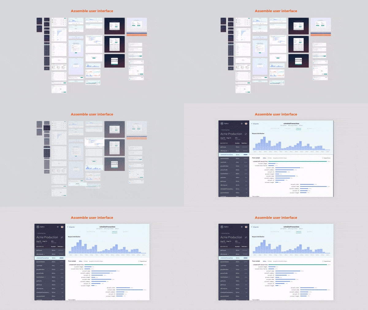
Throughout history people have found that it’s more productive if people assemble new products from existing parts. User interface engineering is no exception. Composing new views out of existing UI parts is faster than building them from the ground up.
At first these patterns took the form of ad hoc code snippets. They lived in text files stashed somewhere on developers’ machines (pre-Github). Albeit not very shareable, these bits of UI code had enormous utility to the frontend developer.
Bootstrap and UI toolkits
Bootstrap came along and consolidated these pieces of UI code into a single well-documented collection. The key idea of UI toolkits was to provide an inventory of generic/universal design patterns (with accompanying code).
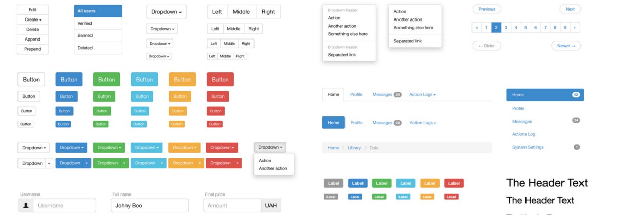
At the time, the workflow was revolutionary in its simplicity. You copy–pasted markup and got workable user interfaces. UI toolkits made it trivial to scaffold simple sites and line-of-business apps.
The concept of UI toolkits had an enormous impact on design and development. It proved that designers could ensure user interface consistency throughout the development process. It also highlighted how easy it could be to create UIs using a toolkit to developers.
Living styleguides
Living styleguides are organization-specific UI toolkits. Teams saw the inherent value in UI toolkits, but often had specific look and feel requirements. They couldn’t just adopt Bootstrap, Foundation, or Semantic.
The classic downside of something like Bootstrap is that you must adhere to its prescribed idioms and styles. Sites that rely on popular toolkits tend to look the same. You can probably see why this isn’t ideal for a company looking to stand out in the market.
Like Bootstrap, living styleguides provided a similar inventory of design patterns along with code, but these patterns reflected the particulars of company branding and design.
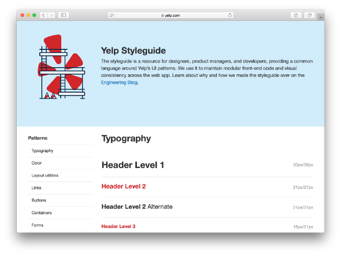
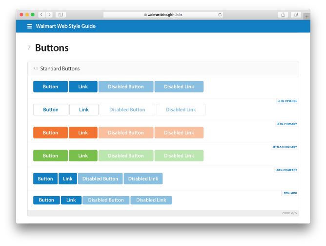
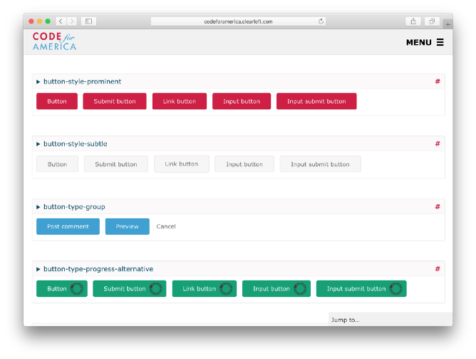
At the scale of Yelp, Walmart or the US government, reusing existing design patterns yielded massive efficiency gains. Living styleguides made it easy for big companies to create a consistent look and feel across their web properties.
However, creating a living styleguide is a significant undertaking — often requiring coordination from the top down. There are countless UI permutations to design, build, and maintain accompanied by the daunting task of getting buy-in from everyone on the team. Realistically, the luxury of living styleguides was reserved only for large teams.
Component libraries
Component libraries are a pragmatic way for teams –large and small– to get the ease of Bootstrap, the customizability of living styleguides, and the flexibility of modern view layer technology.
The widespread adoption of view layers like React, Angular, and Vue compel teams to decompose UIs into simple components. These components serve as the building blocks of apps; the collection of components is the basis of a component library.
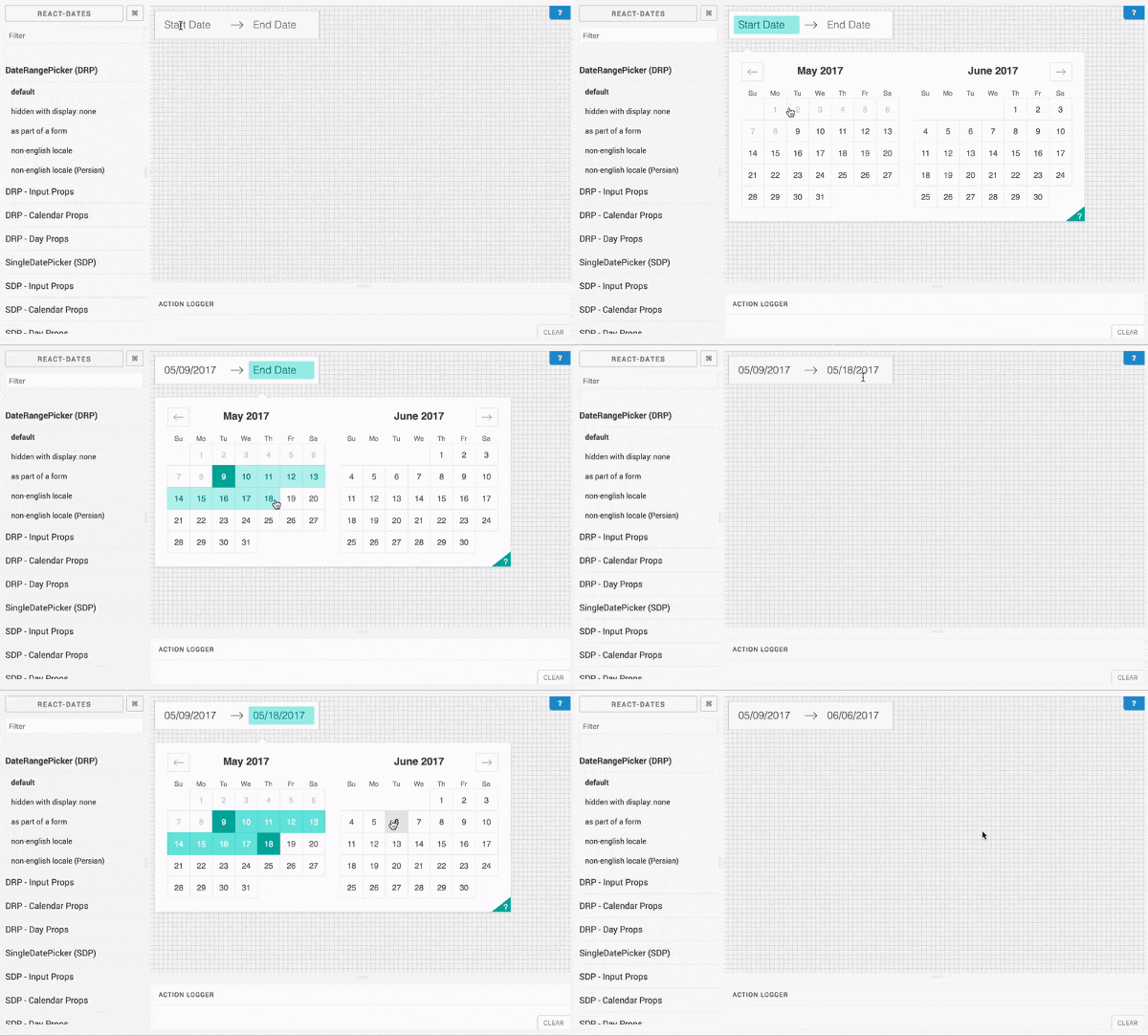
Components: self-contained functionality
As a construct, components are more powerful and easier to use abstractions than raw code. They are self-contained pieces of functionality that have well-defined inputs and outputs.
Self-containment encourages developers to scope functionality, markup, and styling(this area is rapidly evolving) at the component-level. No need to rely on toolkit-level JavaScript or stylesheets, with UI components all of this can be encapsulated in the component.
Small teams can build component libraries
The focus on components –the user interface equivalent to Legos– makes it easy for small teams and individuals to start building their own inventory of custom design patterns piecemeal. Since you progressively accumulate UI components, the startup cost of a component library turns out to be less than building a living styleguide (which often requires much forethought and planning).
In addition, flexibility is inherent to component libraries. Each component can be added, updated, or replaced without affecting the integrity of the library. This means that you’re not constrained to one UI toolkit at a time, you can mix, match, and customize components from around the web as needed.
How do I get started?
Whether you have an existing app with components or are building one anew, starting to accrue the benefits of a component library is easy. Since you’re able to add components individually and the tools to build libraries tend to be development-only by default, the cost to try a component library is close to nil. Let’s see how to get started in 4-steps.
1. Get a place to “store” your components. Components are often buried inside apps. This isn’t ideal because people have to scour through directories and screens to see components in action. What you want is a central place to catalog and visualize your components. You can find these library-like features in a component explorer.
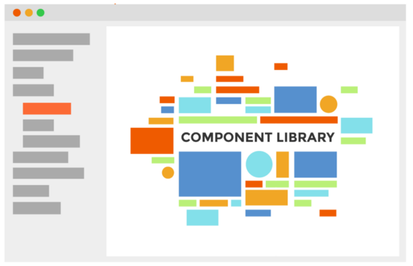
Component explorers
- React: Storybook, Cosmos, Carte Blanche, Styleguidist
- Angular: UI Storybook, Playground
- Vue: Vue play
- Ember: Freestyle
- Clojure: Devcards
2. Index existing components. Once you get a component explorer, it’s time to index your app’s existing components so they can be found.
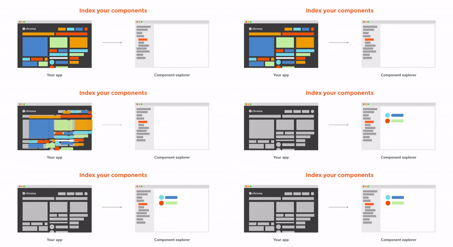
Start by importing the component explorer tool at the top of your component file (the exact syntax varies between component explorers — I’m simplifying for readability).
import { specsOf } from ‘@component-explorer/explorer’;
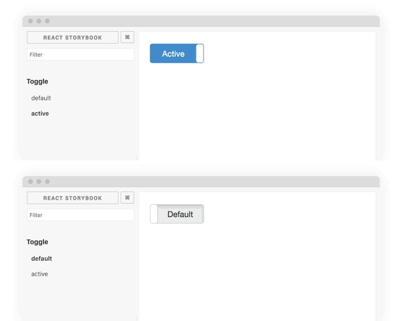
Next, write your first “test” states for that component as specs. For instance a Toggle component might have default and active state.
specsOf(‘Toggle’)
  .add(‘default’, () => <Toggle active={false} />)
  .add(‘active’, () => <Toggle active={true} />)
Then checkout the component in action via the component explorer. Repeat this process to index other components and grow your library.
3. Browse thousands of open source components. There are plenty of readymade UI components available from organizations like Salesforce, AirbnbEng, and Google. Familiar UI toolkits like Bootstrap and Foundation have also been converted to UI components. For complex components like graphs, I suggest browsing what is already available before building something from scratch.





4. Add open source components to your library. Once you’ve found something you like, it’s time to put it in the component explorer (as we did in step 2). This gives you an isolated playground to tweak the readymade component before integrating it into your app.
Let’s simulate the process of adding an example LineGraph component to the library.
Installing via NPM: npm install linegraph
Create a new file to import the component, the component explorer, and record the test states as specs.
import { specsOf } from ‘@component-explorer/explorer’;
import LineGraph from 'linegraph';
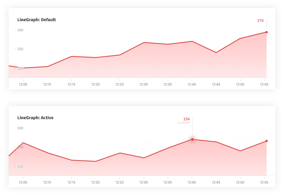
Add a few test states to adjust the look and feel in isolation with your component explorer. Here’s how the component would look with a default and active state:
specsOf('LineGraph')
  .add('Default', () =>
    <LineGraph data={latencies.map(latency => ({
      latency,
      count: 5000 + Math.random() * 15000,
  }))} />)

  .add('Active', () =>
    <LineGraph active={true} data={latencies.map(latency => ({
      latency,
      count: 5000 + Math.random() * 15000,
}))} />) 
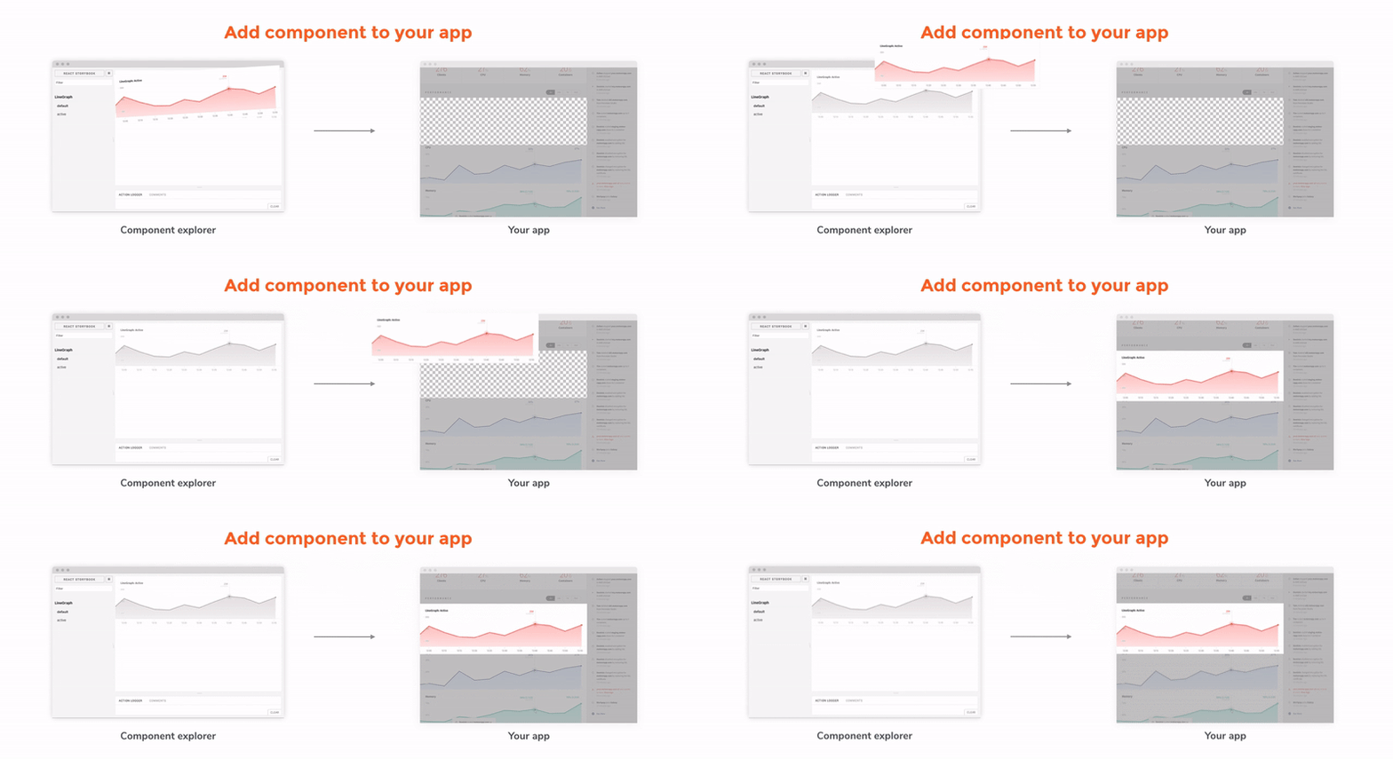
Once you’ve adjusted the specs to match your needs, it’s simple to add the component wherever you need it in your app and use similar specs to achieve the intended appearance.
Beyond Bootstrap
Bootstrap pioneered the use of readymade user interfaces. People could pull interface elements off the shelf to rapidly build UIs. However, it required adherence to prescribed idioms and styles.
Living styleguides allowed organizations to offer the same rapid development experience as Bootstrap with a custom look and feel. The challenge was that these styleguides required significant effort.
A component library is a practical middle ground that enables rapid development and customization without needing much in the form of organizational momentum. Here at Chroma, we are big proponents of component libraries because they tend to guide teams into reuse and UI consistency without being authoritarian about it.
Learn more about UI components:
Why you should build UI components in isolation »
5-step guide to creating modular frontends »