Know thy enemy — using design trends to your advantage
Where do trends come from & how to make them a tool
Do you ever get the feeling that work from years past is somehow dated? Perhaps you wonder why companies often rebrand. Or noticed that trends like skeuomorphic and flat design seem to be flashes in the pan. Why?
What you’ve experienced is the phenomena of visual motifs becoming less effective over time and the natural reaction to this: trends. Trends aren’t arbitrary, they embody two existing biological imperatives: competition and adaptation. The interplay of these hardwired traits is the reason for the creation and adoption of new visual treatments. This article goes over the mechanics of trends and how to use trends as a tool.
What makes design work?
Evolution has hardwired the brain to elicit instinctual responses to environmental cues. Stimuli like the color red, bitterness, and loud noises subconsciously trigger heightened states of awareness that our ancestors relied on to survive. Despite moving beyond the hunter-gatherer past, reactions programmed into the human genome continue to play a key role in decision-making.
Sight is a cacophony of colors, shapes, and patterns. The brain has a limited ability to process everything you see so it’s hardwired with shortcuts to ensure visual characteristics necessary for survival are prioritized-first. Design hijacks the same shortcuts to capture attention and communicate abstract ideas.
In an era where imagery is the vehicle for mass communication, design’s ability to control interpretation through visuals is an essential tool for influencing people’s decisions.
Competition
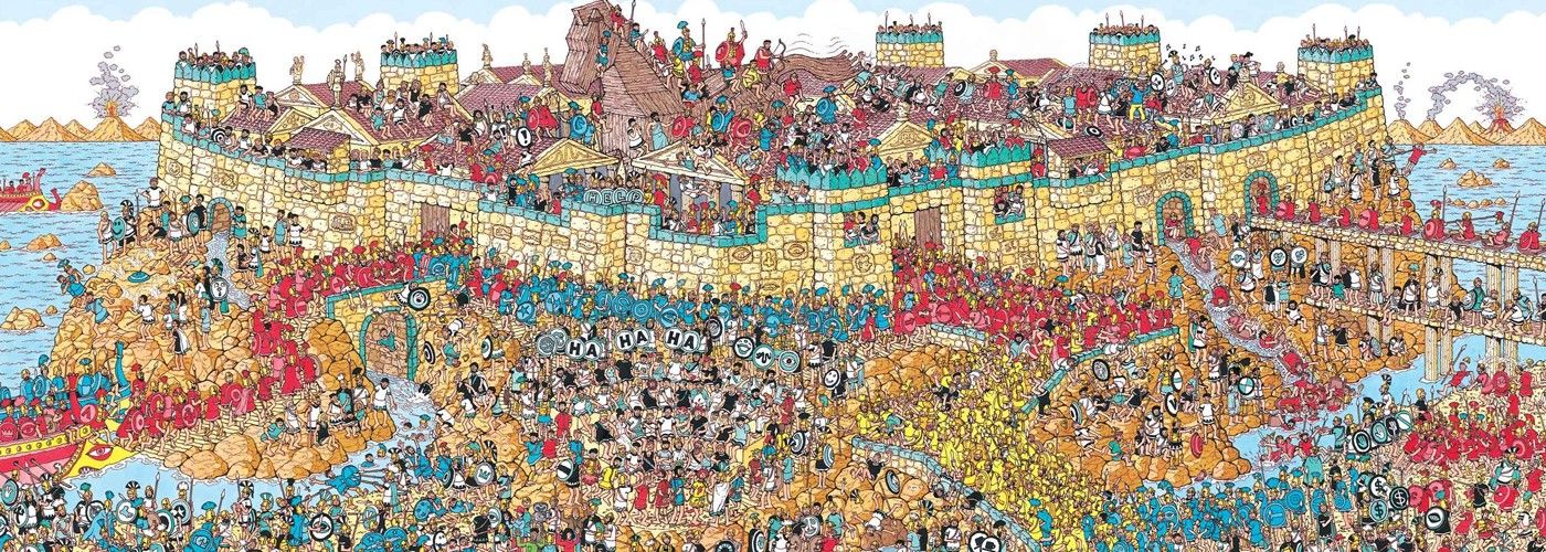
From an evolutionary perspective competition determines access to mates. Self-promotion is the primary tactic social animals like humans use to attract mates. Displays of power, intelligence, and physical attractiveness help individuals differentiate themselves. Just as our ancestors sought to stand out to pass on their genes, so too must products differentiate to thrive in the market.

By changing the visual properties humans are programmed to notice, designers create avenues of differentiation that help products stand out in the market. Design differentiation refers to the visual and experiential qualities that help products appear distinct [see: ‘How design works’ above]. Functionally similar products are able to coexist because design opens subjective avenues of competition like lifestyle, values, status, gender, and more. Products win customers by showing they’re the best fit for users’ objective and subjective needs. Since users are unique, there can be as many successful design permutations as there are potential users.

Adaptation
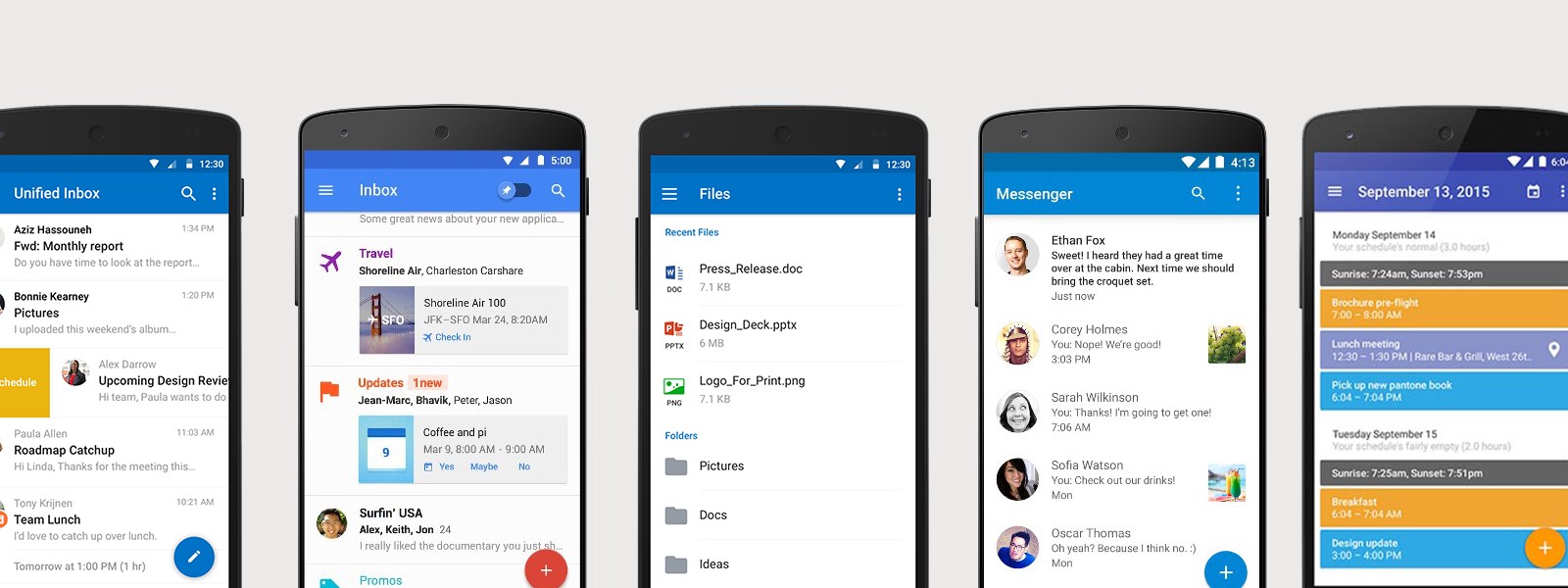
Differentiation is short-lived. Offerings cannot remain unique indefinitely. Humans also have the tendencies to copy each other [2, 3] and adapt to their environment. The design characteristics proven to attract attention will be copied ad infinitum. And the more popular graphical treatments become the more people adapt-to and normalize the attention-grabbing visual properties. Products seeking to set themselves apart are therefore obliged to continuously evolve their design patterns to remain differentiated.

Trend
Trend is a phenomena that encapsulates the cycle of competition and adaptation. It is also a tool. Designers are not passive observers but active participants in trends. The use of a trend can result in a shortcut or detour.
As a shortcut, designers following trends can save users time, a.k.a., cognitive effort, by applying patterns that have already been established, socialized and reinforced by the trend adherents at-large. For instance, the ubiquitous hamburger menu remains effective despite research suggesting that it’s not ideal for usability[4].
As a detour, designs that rely on identical visual cues are difficult to distinguish from one another. They are made generic, or worse, camouflaged. Humans are prone to decision fatigue, analysis paralysis, and are downright lazy. Decision fatigue is the decline in rational decision-making when confronted with many decisions. Analysis paralysis is the inability to make a decision due to over-analysis and excess choice. When a user is asked to choose from a wealth of indistinguishable products they tend to make subjective “gut” decisions or none at all.

Moving forward
Design is temporal. Over time eye catching aesthetics are destined for dilution into the visual vernacular. Trends die. Aesthetics must be periodically reassessed to remain distinct. Trends live.
Designers must strike a balance between the expedience of following and the excitement of pioneering. So when you’re out there designing something new start by considering if you are creating new trends or following them. Does your work need to stand out from the crowd or quietly support the whole?
Reference
[1] Bandura, A. “Social Learning Theory”. New York: General Learning Press. 1977
[2] Schmitt, D.; Buss, D. “ Strategic Self-Promotion and Competitor Derogation: Sex and Context Effects on the Perceived Effectiveness of Mate Attraction Tactics”. Journal of Personality and Social Psychology, Vol 70(6), 1996
[3] Fisher, M.; Cox, A. “Four strategies used during intrasexual competition for mates”. Personal Relationships. 2010
[4] Chartrand, T.; Bargh, J. “The Chameleon Effect: The Perception-Behavior Link and Social Interaction”. Journal of Personality and Social Psychology, Vol 76(6), 1999
[5] Foster, J. “Mobile Menu AB Tested: Hamburger Not the Best Choice?” Exisweb.